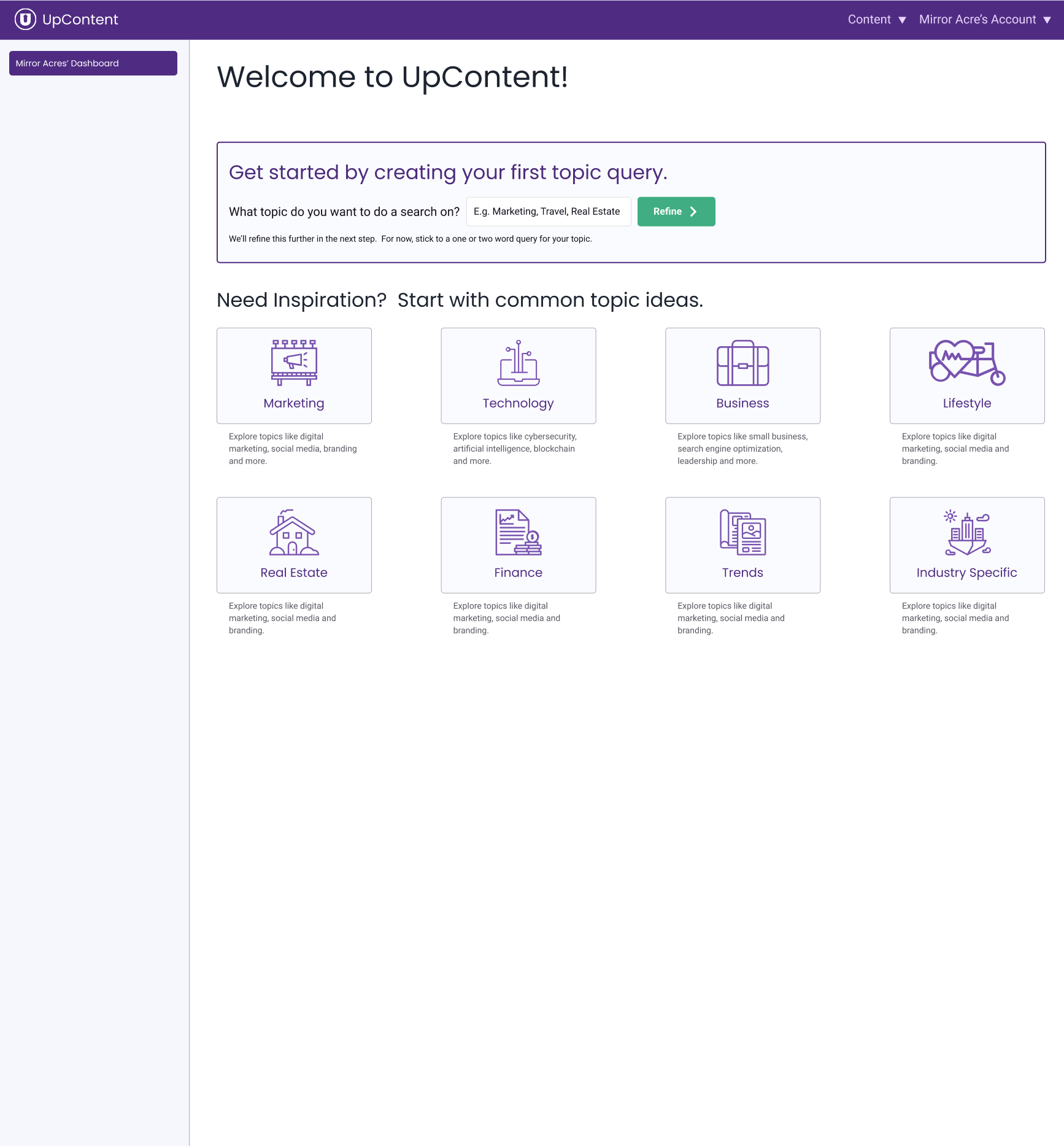
The dashboard on the first visit, before any configuration has been done on the account.
The dashboard after "topics" have been configured.
The dashboard after the account have been setup.
I created the following designs for the introduction of a dashboard to the client's web application. This was part of an ongoing effort to improve conversion rates for new customers, the first piece was a sign up redesign.
The idea was to give users a starting point for when they enter application. Without the dashboard users would log in and be presented the last screen they had visited. In cases where the account wasn't setup, users were shown a welcome screen which directed users to either start with sample content or figure it out themselves.
Stage 1: A New "Welcome" Screen
This product's main purpose is to find articles from search terms for sharing. The user creates a query, which can have subqueries, to find articles. They can then further filter those results. The last piece is sharing those results, which can be done with in-app or third party integrations.
Before anything can be done in the product, the user needs to create a search. In the context of this product, that is referred to as a topic query and is usually shorted to just topic. Every customer will want to create at least one topic, and so the initial state of the dashboard is focused just on that.
Creating a topic query had a simple first step, enter the name of the topic you want to do a search on. But, if you've ever written a school paper then you've probably experience the sensation of brain freeze. A world of infinite possibilities beyond an empty box for customers to get stuck on. To solve for this writer's block scenario an inspiration section was included.
The pre-built topics are taken from a compiled list of the most common topics users were creating.
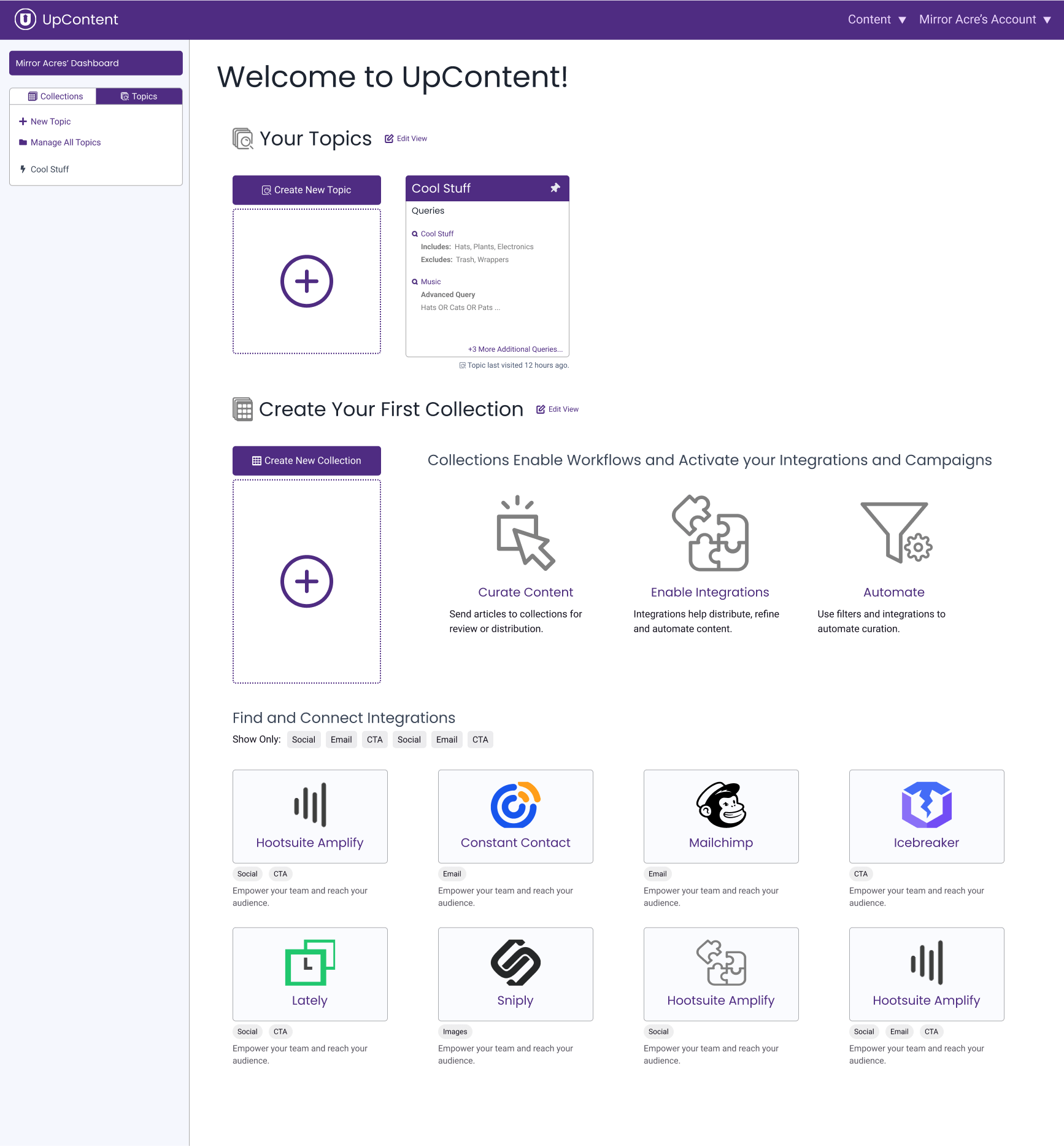
Stage 2: The "Now What" Step
Once user's have their first topic, it becomes very difficult for us to predict what they will need to do next. Most users would need to create a "collection" at some point.
A collection was like a folder of results. Users could either manually send results to a collection, or have a collection pull in results from another source automatically. A collection could pull from multiple sources, which could be any combination of topic queries, other collections or RSS feeds. When a collection pulls in sources, it can apply a filter as well. Most of the third party integrations were applied to a collection in some way.
However, without these dashboard, none of this collection business would be visible to the users. They had to learn it themselves, either by randomly clicking through the UI, reading help articles, or contacting support.
Integrations suffered from the same problem of being invisible to the user to an even greater extent. Data was showing trial users who didn't convert never explored integrations.
So the goal of this dashboard view was to expose the breadth of the product. It still needed to guide users through setup, but needed to have a bit of a choose your own adventure angle to it.
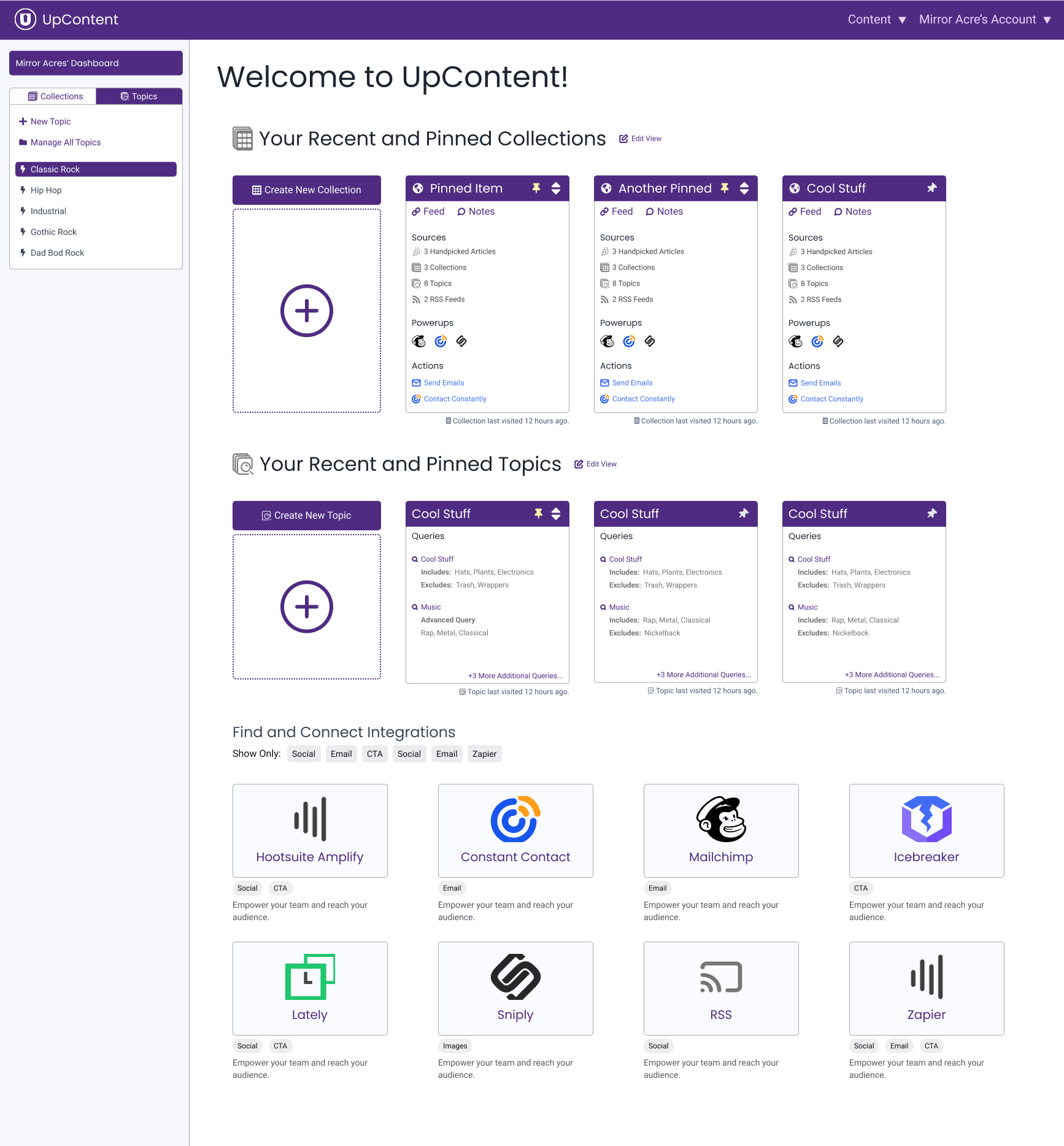
Stage 3: Just a Normal Dashboard
Dashboards are usually the big #2 in any web application, second only to the login page. They're the gateway into application. When you walk into the kitchen and pause for a brief moment to ask yourself, "why did I come in here again?" Bam, that's what this Dashboard hopes to solve.
I didn't want to wildly disrupt the current behavior of dropping the user back to the last place they were in the app. Thus the decision to have a list of the most recently visited topics and collections. This also allowed for showing multiple results and evolved into being able to pin favorites.
To address some additional concerns the dashboard can also be further tuned by the user. This includes the ability to hide the large "Create a new..." sections and change the max number of recent items to show.
Having a dashboard also created real estate to expose additional features of the product. For these initial designs, that was to give visibility to third party integrations.